
Optional critical illness insurance journey
How might we improve the way users learn about and purchase critical illness insurance through their benefits provider?
BackWhat does that even mean?
Critical illness insurance is claimed upon diagnosis with a... covered critical illness (this includes many diseases and certain types of cancer). Optional critical illness insurance means that the user already has benefits with Sun Life and can purchase critical illness insurance as an add-on to their group benefits plan.
Empathy
I met with the Product Owner to align on the next steps. For me, it was research — specifically into our users' mental models and needs. In this case, we were looking at a rather broad target demographic: group clients (users who have benefits with Sun Life) who do not already have optional insurance products. I conducted user interviews, a competitive analysis, and an assessment of our current state flow to better understand how we can improve the experience.
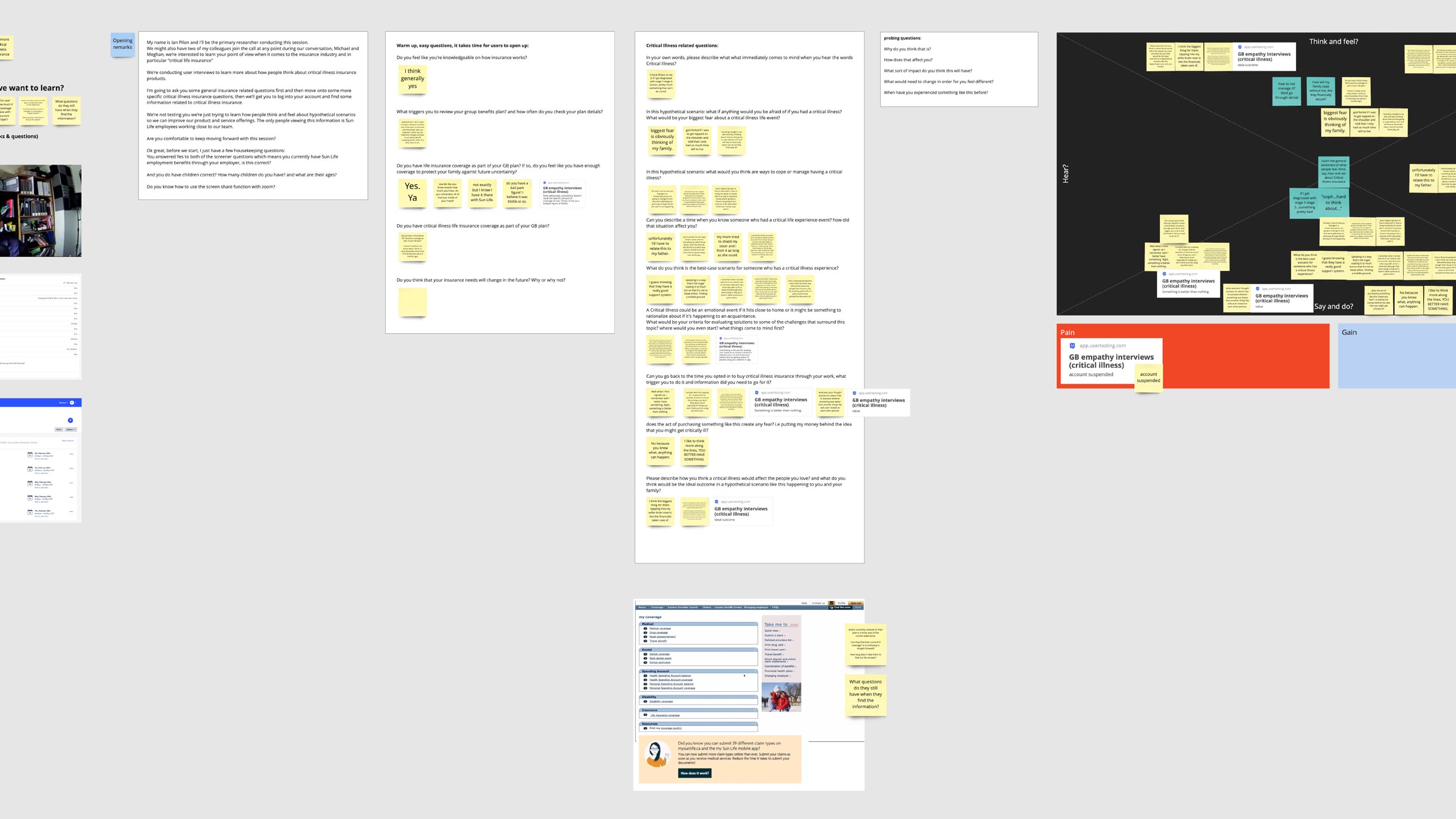
User Interviews
"My biggest worry if I get diagnosed is not being able to take care of my family."
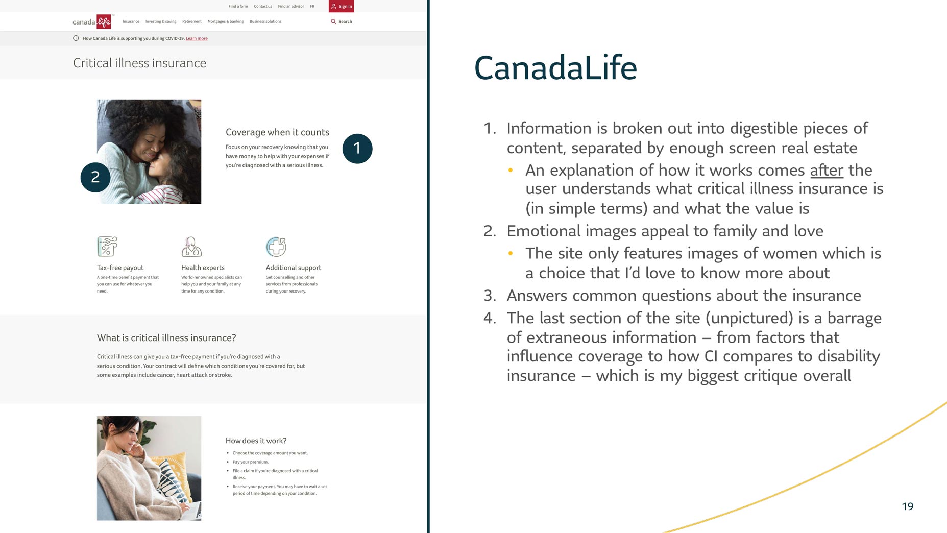
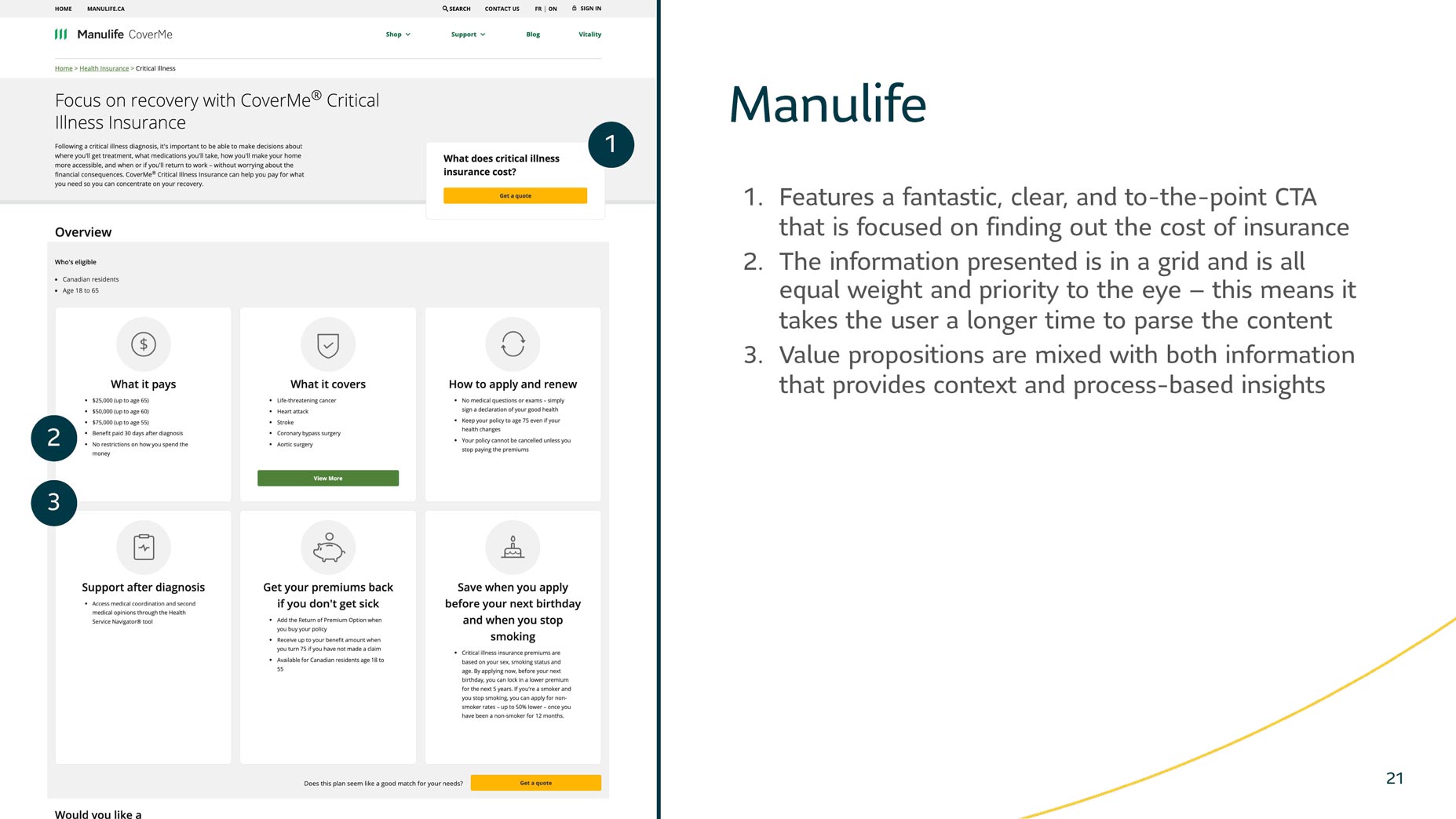
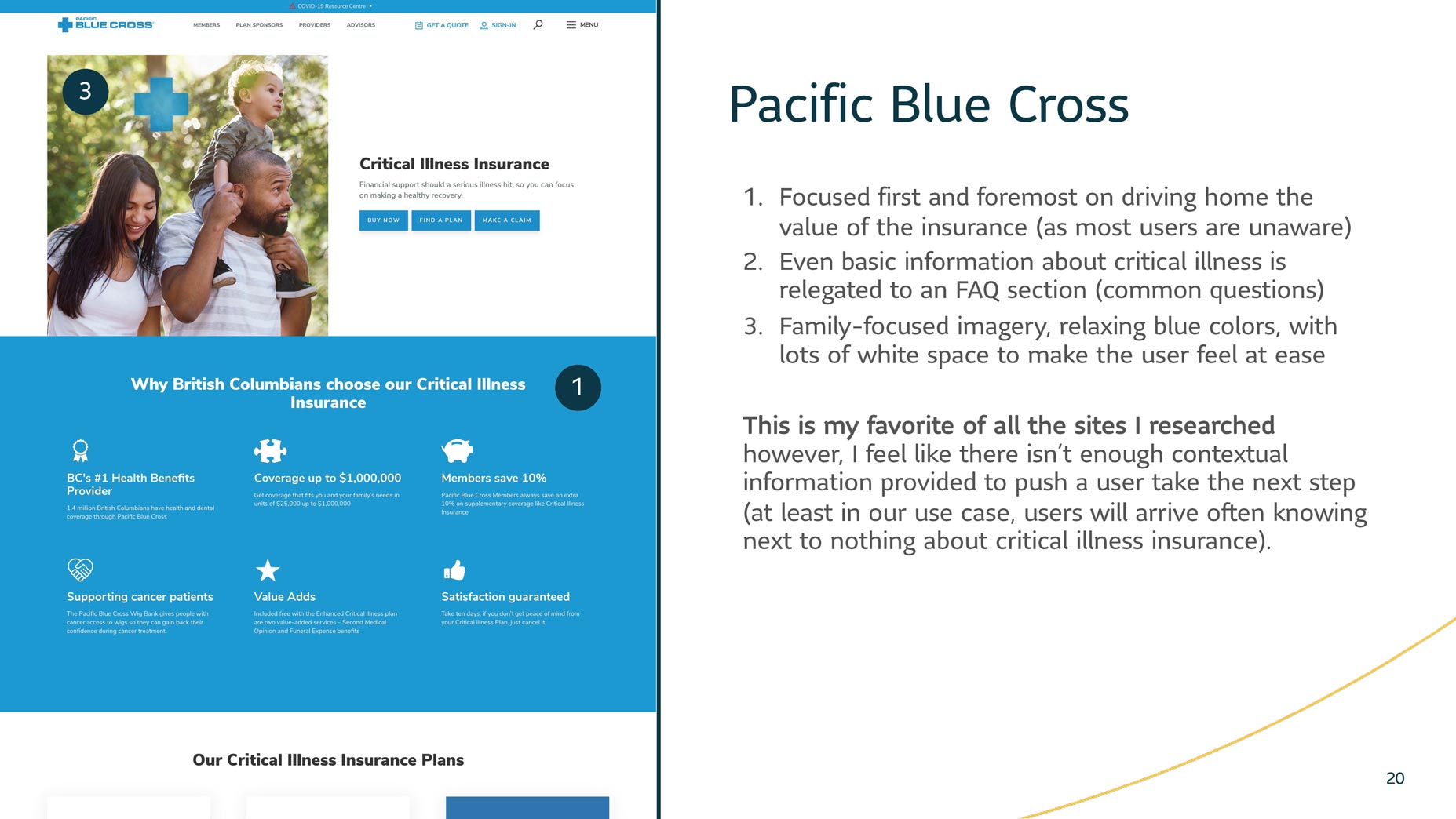
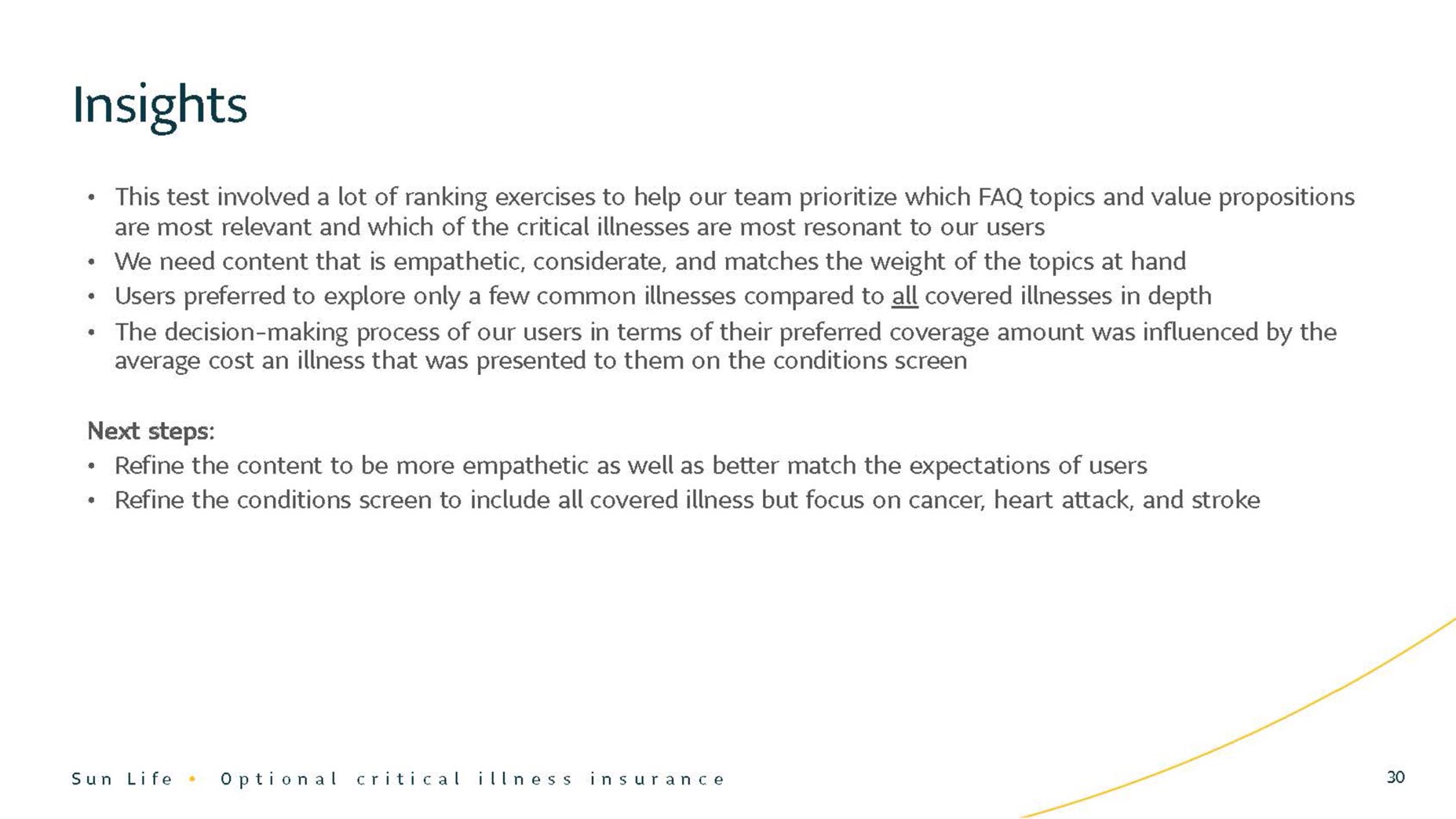
After creating a discussion guide and interviewing ten users, some key observations were made. While clients tend to avoid thinking about a diagnosis for themselves, many have seen a friend or family member affected by a serious illness. It's a personal, emotional topic with often minimal transparency in terms of financial impact. Product comprehension is incredibly low and I observed that users are primarily focused on the cost of insurance — an important distinction between this and its retail counterpoint (where users are focused on needs). Due to the nature of the optional critical illness, users have more of an "add-on" mentality with purchases.
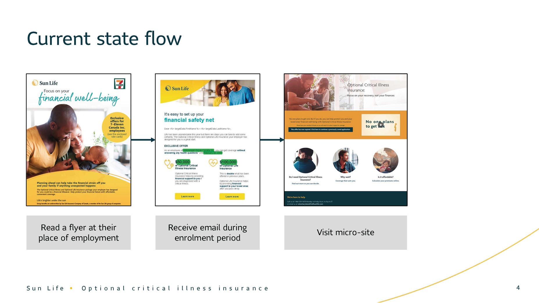
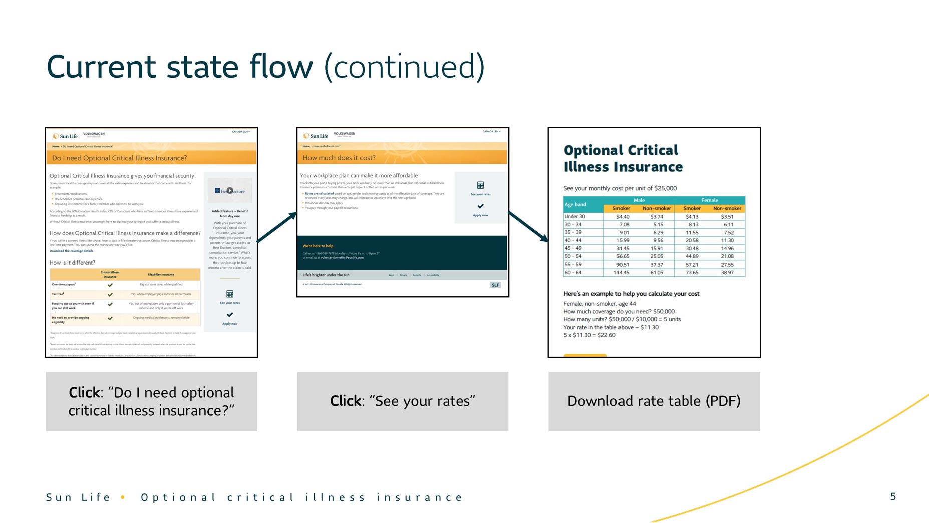
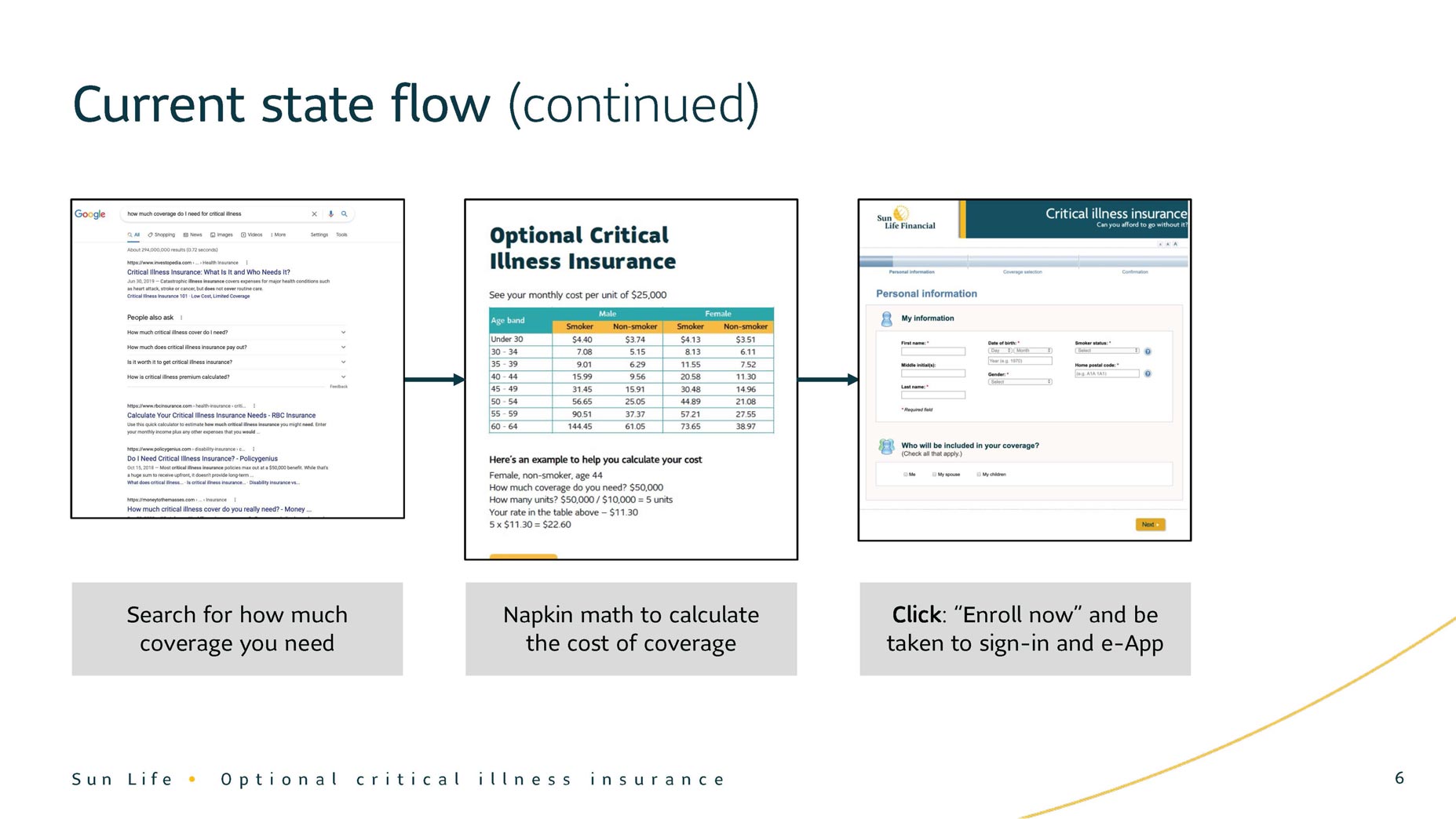
Current State and User Needs
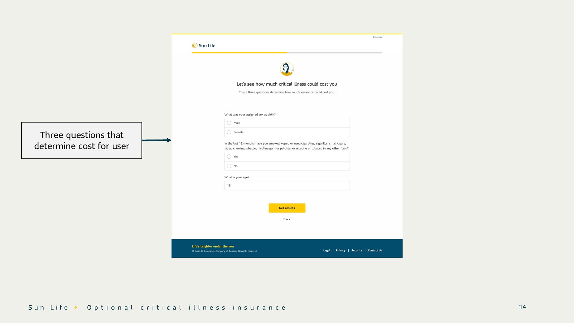
After mapping out the current state, I saw how the journey was unintuitive and disparate. An interested client goes from a marketing email to a micro-site, to a PDF, to napkin math, to signing into their Sun Life account — all before finally arriving at the online application. Many simple, structural changes could improve this flow. We also heard some core needs: to understand what critical illness is and its value, to quickly see how much it will cost, to be spoken to in a way that's empathetic, considerate, and informative, and to receive a straightforward path to purchase.
Defining the Problem
I facilitated a Lean UX Canvas session to create a clear, shared understanding of our problem. This would be a short build — moving from discovery to production in about four months. This would enable us to test our solution with real clients during an upcoming campaign period. We could watch how the new site performs and iterate. With all that in mind, we created the following problem statement:
How might we help group clients understand the value of optional critical illness insurance, quickly surfacing the cost in a more streamlined experience?
Ideation
One choice I want to highlight was the intentional involvement of our front and back-end developers as early as possible. I facilitated a session with our entire squad to discuss initial ideas, walking through user research and our approach to design. These types of sessions are invaluable, providing the team with agency and insight into the design process (which can too often be a black box) and helping us identify technical challenges earlier than usual. One major design problem was providing a thorough look at the product while creating momentum within the flow.


Design, Test, Repeat...
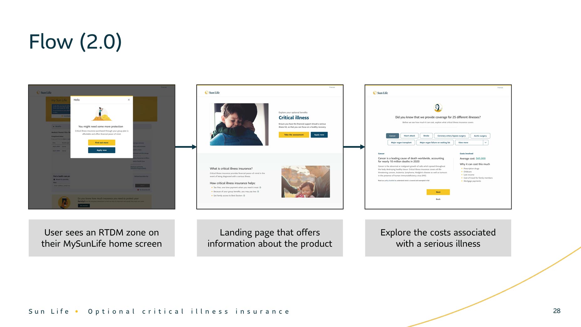
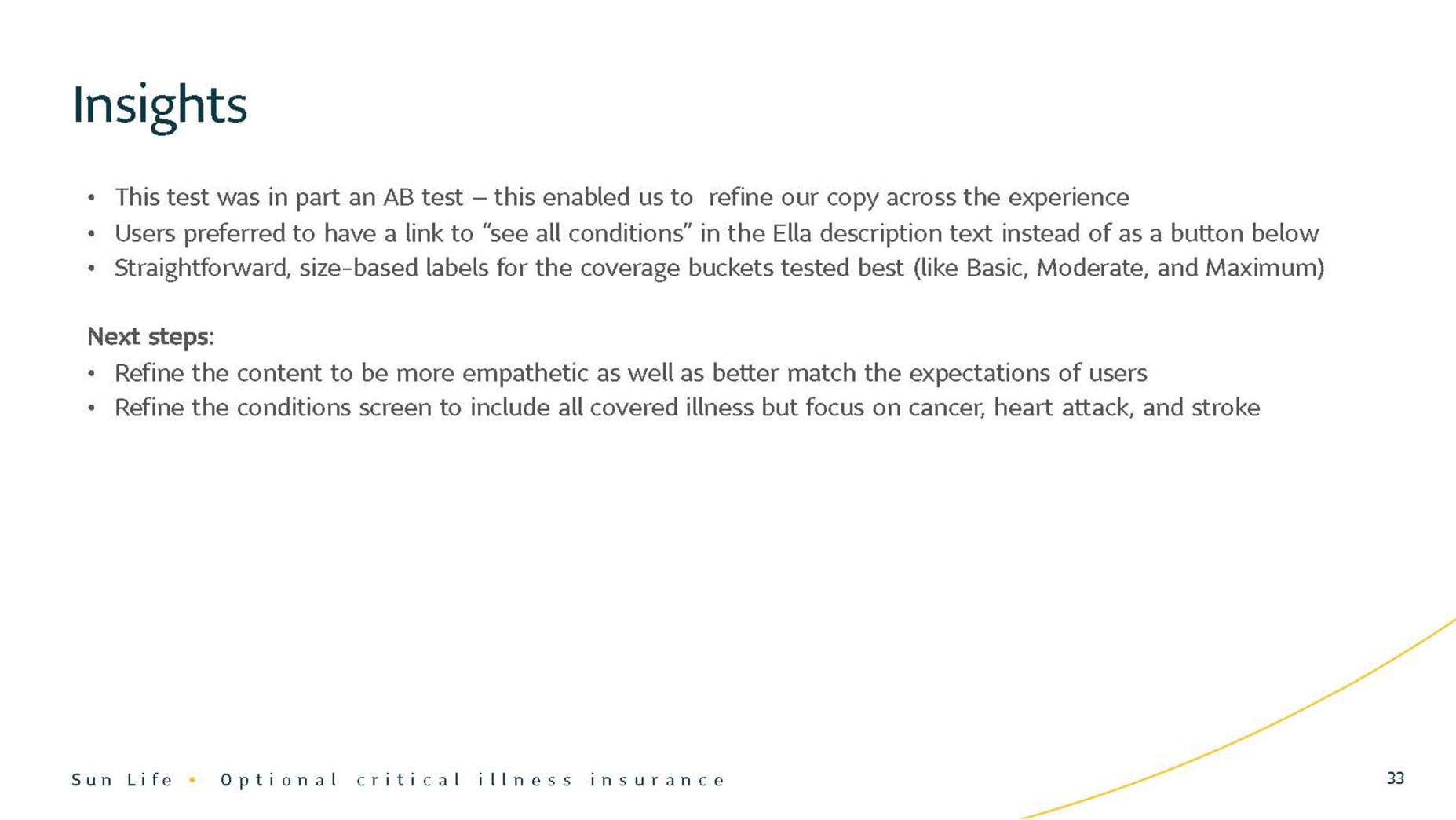
First, I defined a basic user journey that solved for our main use cases. Then I produced a set of low-fidelity wireframes. I'm a big proponent of iterative validation and so my first instinct was to take this to UserTesting.com to collect high-level feedback. Throughout the ideation phase, I conducted four rounds of testing to shape the direction of the design. This process involved: synthesizing and prioritizing feedback from users; gaining insights from the usability tests and sharing them with our team and stakeholders; integrating new content from our UX writer into the designs; iterating on the design, and launching a new unmoderated test for feedback.
Solution
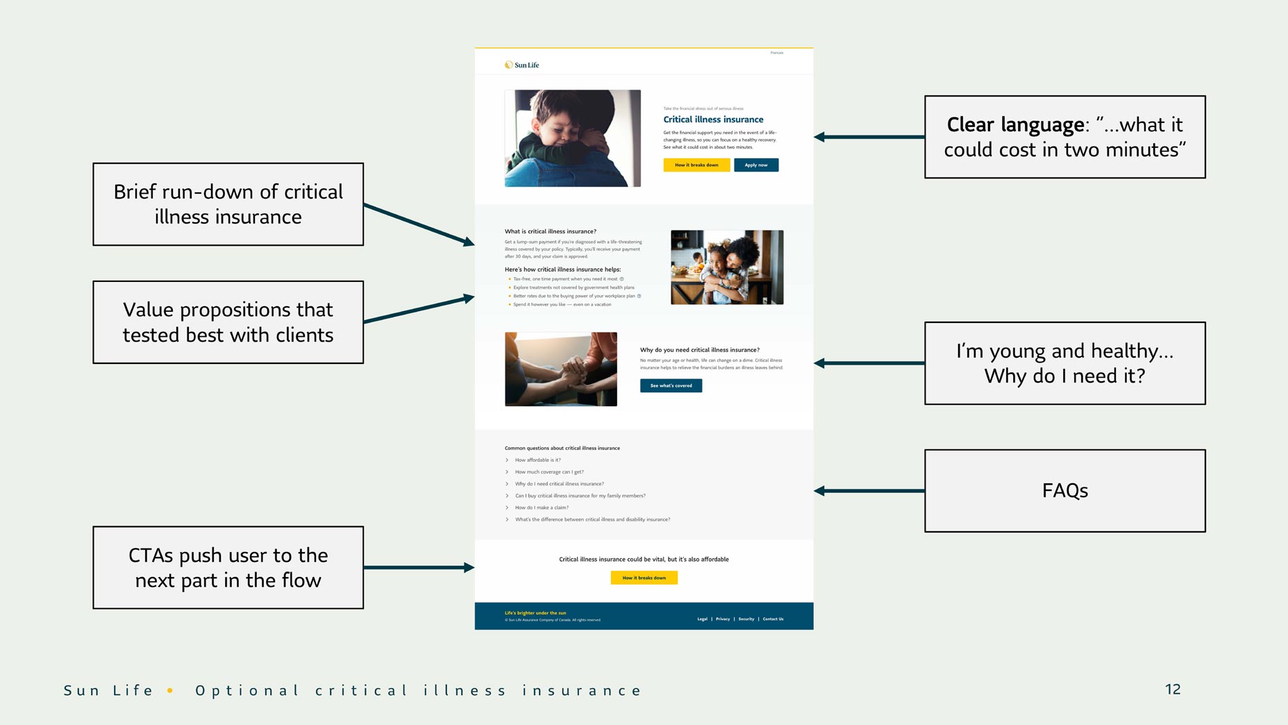
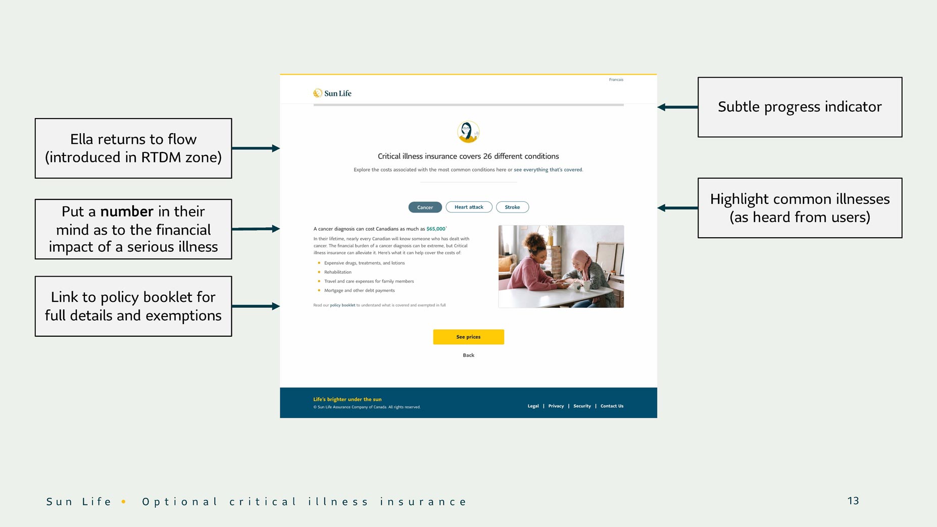
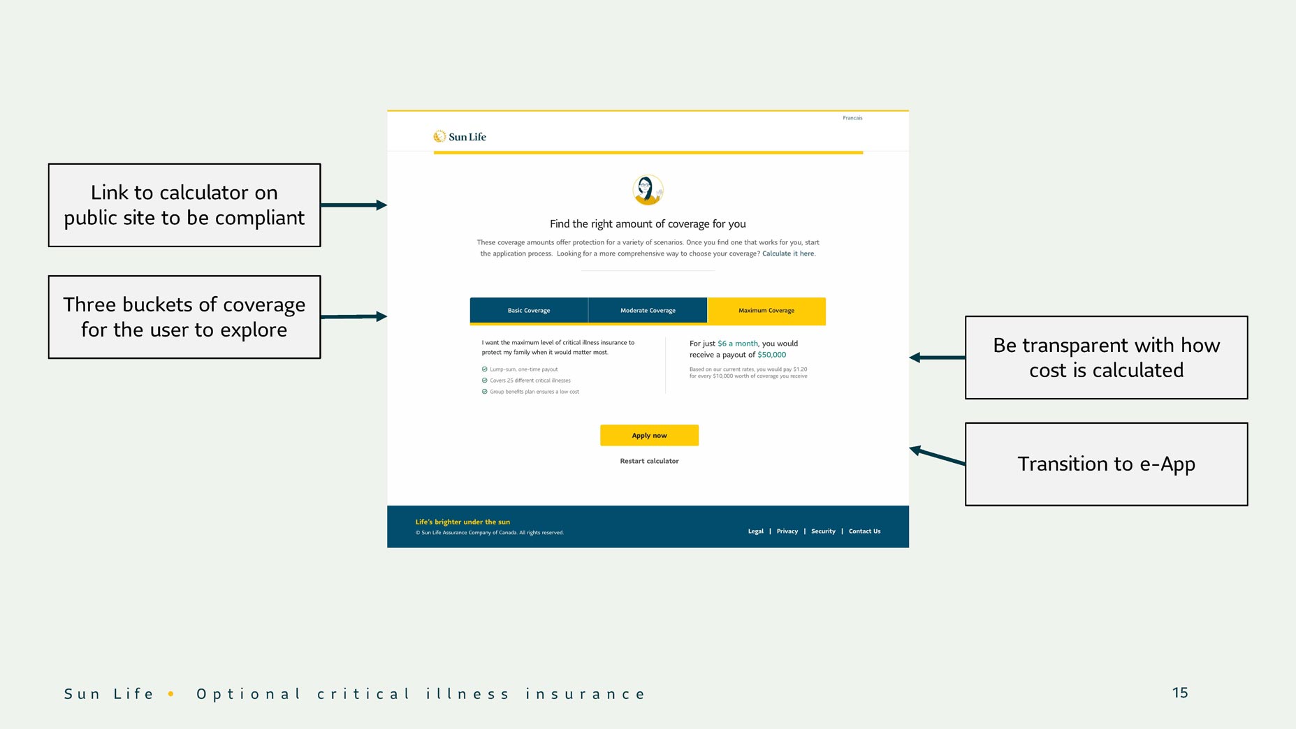
Our new experience was streamlined and focused on price rather than need. It was supported by clear, informative content that showcased the value of the product, and provided a personalized cost of coverage within a few clicks. We not only showed the user how much coverage can cost but contextualized that number in terms of the potential impact that major illnesses could have on their families. This feature stood out from competitors and made for a compelling narrative leading to a purchase.
Collaboration
There are so many opportunities for collaboration as a UX designer. I want to highlight a few of these moments: I spoke to senior stakeholders bi-weekly at our Sprint Reviews to gather feedback on our design decisions, and I worked with our behavioural economics specialist to learn how to influence purchasing patterns. I worked with our UX writer to craft meaningful content that is free of legalese, and I worked with our design lead to ensure that the design system was used properly.
Conclusion
While the initial design thinking process was over, my job was not done. I documented the project and prepared wireframes for a hand-off with developers. I also tackled new challenges as they emerged during the development process (such as defining the handling of specific errors, addressing accessibility concerns, conducting a visual QA, and dealing with the implications of changes to our scope and/or timeline). I balanced all of this with preparing for our next epic.