
Starting a family landing page
How might we design a MVP experience that re-imagines our life insurance journey for new parents?
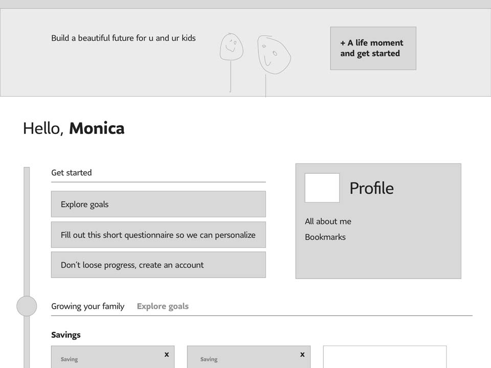
BackDefining our MVP
Coming out of our MVP workshop, my team was able to define an initial user journey that tied together the most opportune north-star epics. I sketched out the first pass of this flow, which helped us communicate our vision to team members and leaders.
Guiding Principles and Scope
Our team grew to include developers as well as marketing and analytics specialists. This allowed me to learn more about Adobe Analytics and create my own dashboard. As the build began, I helped us remain focused on the Client and reduce pain points within the experience. We strived to test frequently and make design decisions based on client feedback and analytics. The scope of our MVP was limited to the first few steps of our north-star journey: a personalized landing page and a holistic financial planning tool. This lets us promote our insurance products to users in a more relevant context. Our target audience was new and expecting parents. Research indicated that retail insurance purchases were often prompted by a life event. New parents were a large opportunity space for us. The design would provide education in a pressure-free environment with centralized tools. Users were often unaware of their specific needs and didn't know where to start when thinking about their changing finances — this led to insecurities when meeting with advisors. We wanted to remove those barriers and create a seamless hand-off to an advisor.

Ideation
I conducted in-person user interviews with new or expecting parents. These sessions included empathy and ideation exercises as well as some co-creation activities. The design was refined week after week with feedback from our stakeholders in Sprint Review and through in-person design sessions. We kept the wireframes on the walls so that others could add sticky notes, scribble on them, or comment in passing. I would collect these insights, update the designs, and test a new iteration.
New Challenges
While we solved client challenges, I encountered my own. Leading design on an Agile squad was new to me. This project pushed me to grow as a designer and professional, leading strategic conversations, compromising with legal and marketing teams, and reducing complexity while preserving our core features to meet tight development deadlines. We did an incredibly short build — about ten weeks. I would regularly test our assumptions and gather data to support our design decisions. This helped me push for the best user experience when having conversations with competing business interests or battling timelines.
Analytics and Improvements
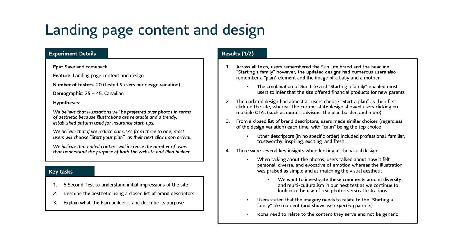
After launch, our marketing campaigns began to drive traffic towards the site. I watched the analytics closely and made some key observations. Earlier in the design process, we had made a compromise with our business partners to place multiple CTAs at the top of the landing page — we saw this was causing traffic to split and go all over the place. The majority of users weren't even hitting our planning tool. This became one of the major problems that we had to solve in our follow-up release.
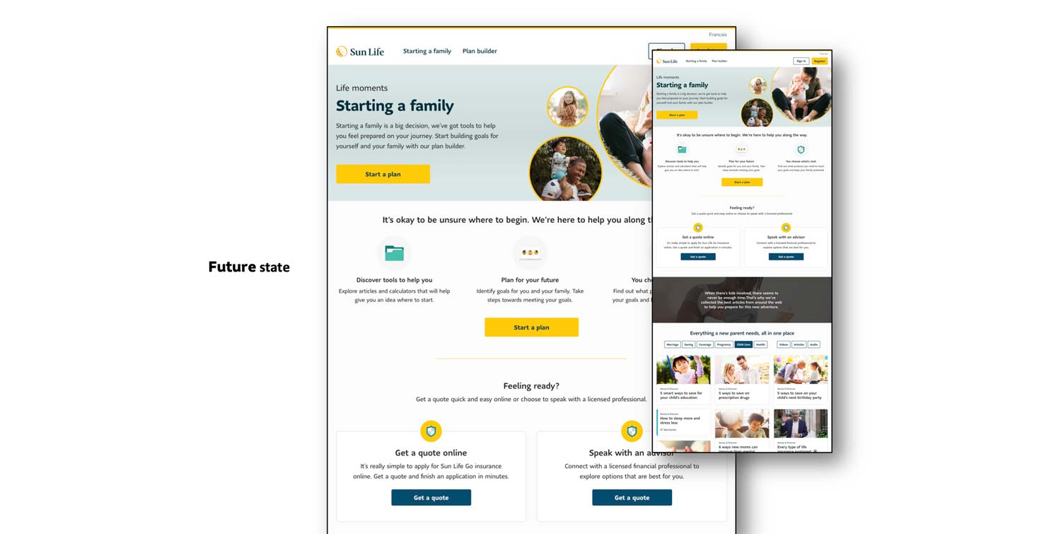
Landing Page Re-Design
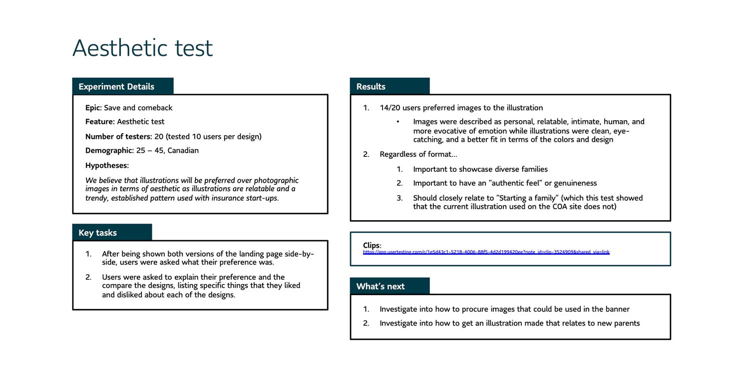
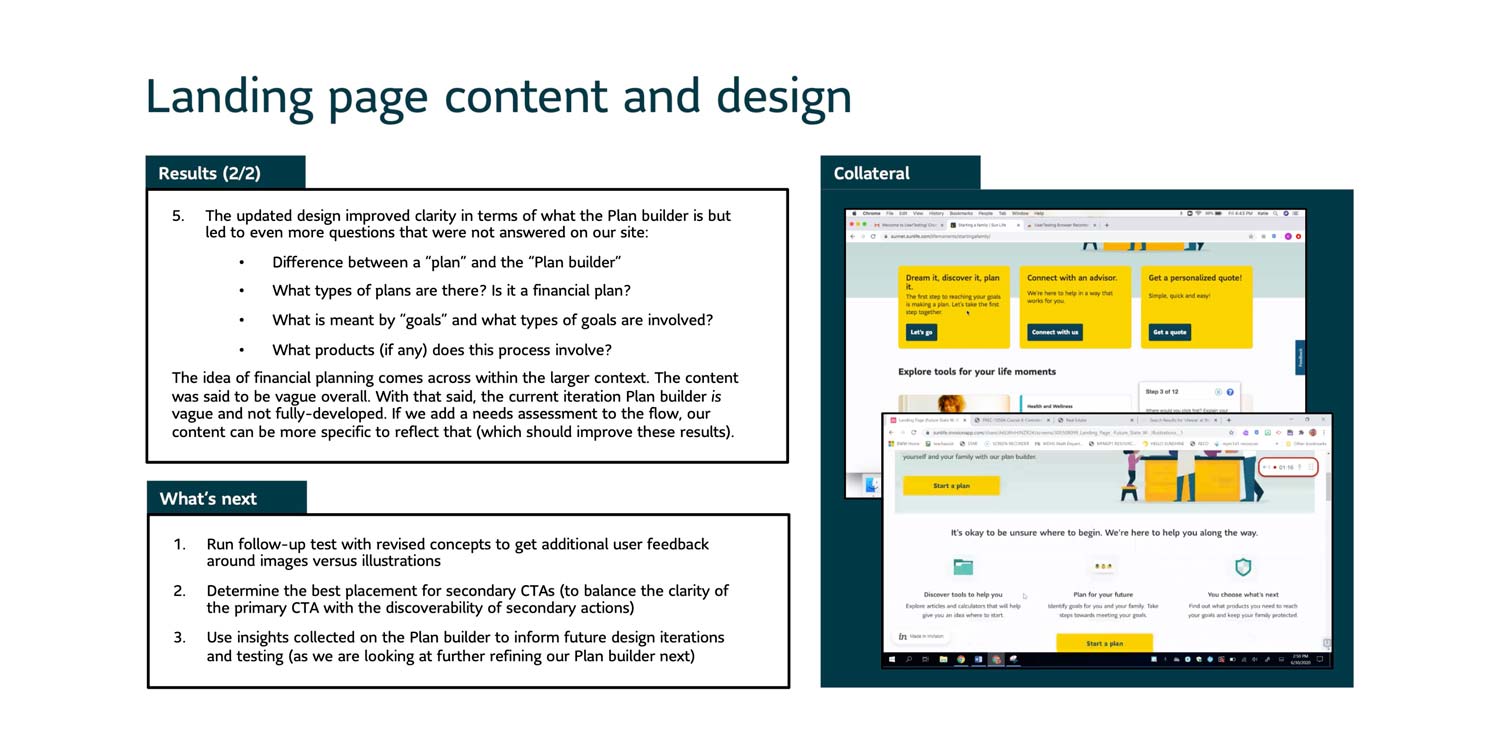
I tested the site with users and noted some shortcomings. Failing fast was part of our process and the team had a second release scheduled to improve on the design. The yellow tiles on the landing page were replaced with a single call to action. Illustrations were replaced with images of real, diverse families. We also clarified what the Plan Builder was — users originally had no idea what to expect before clicking. These changes greatly improved performance. The majority of traffic now went towards the tool. Aesthetic upgrades also improved general sentiment.
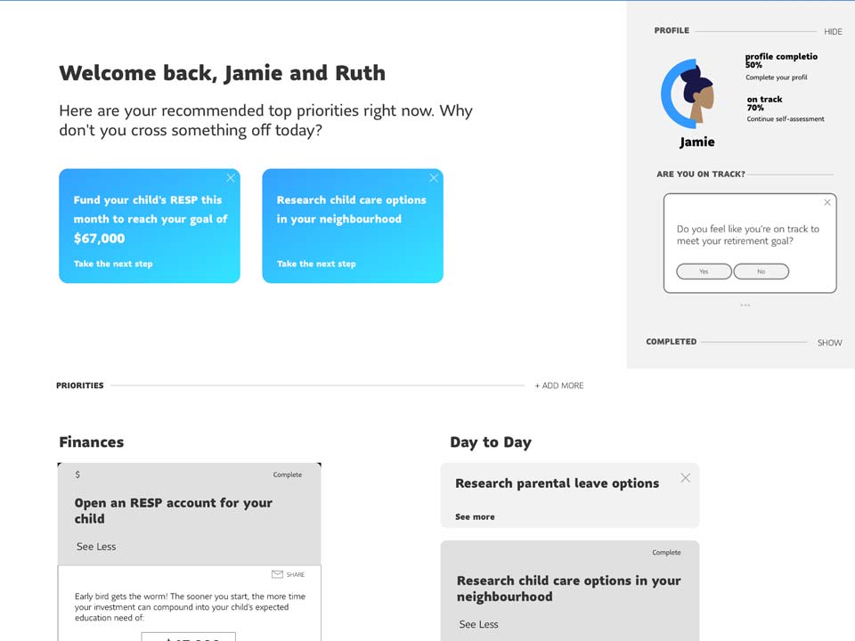
Plan Builder 1.0
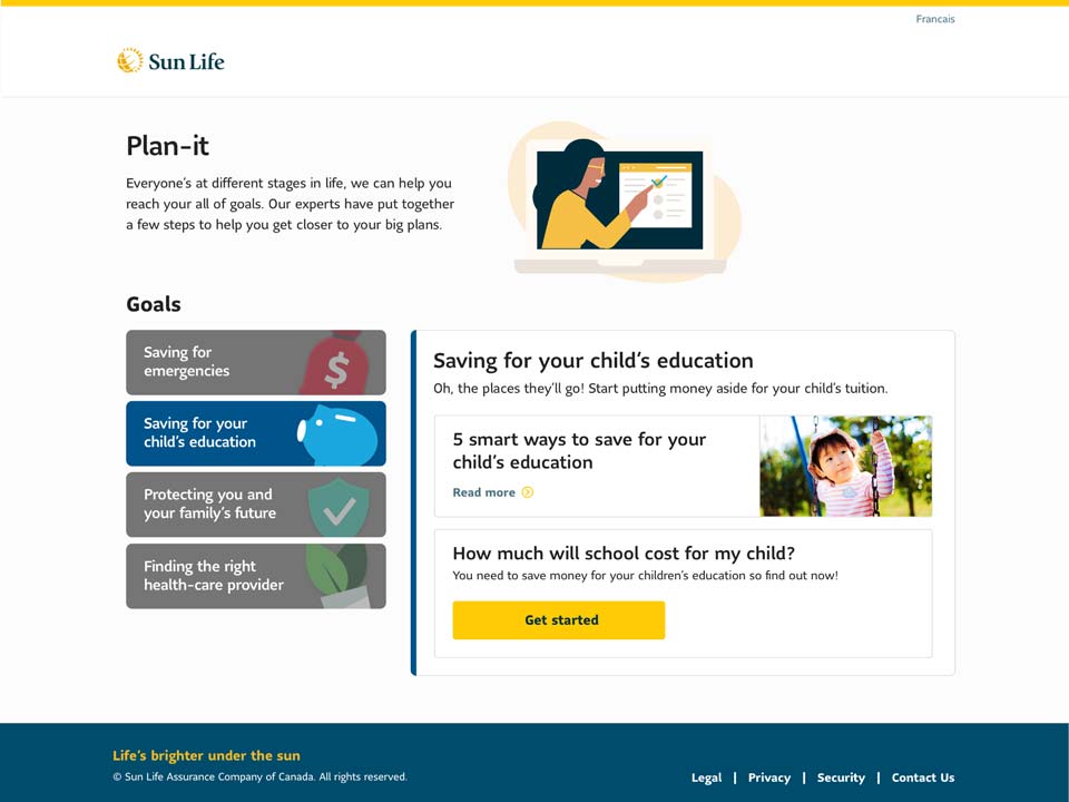
Our planning tool went through several iterations. The goal was always to create a holistic planning tool that enabled new parents to build a basic financial plan (and more easily provide advisors with leads). Early designs took a module-like approach, with each section broken down into horizontal steps. We looked to incorporate elements of gamification to improve engagement and click-through. For our MVP release, we thought about just having a list of prioritized goals. Eventually, we settled on a design that consisted of four sections, each containing a relevant article and calculator. Together they would form an (MVP) financial plan.
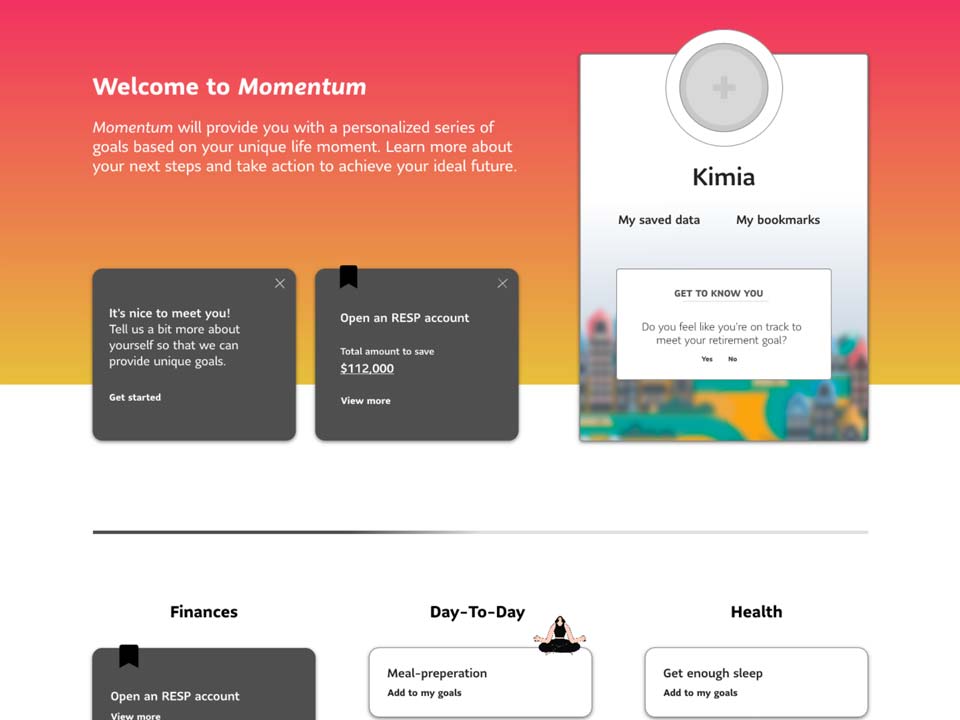

Plan Builder 2.0
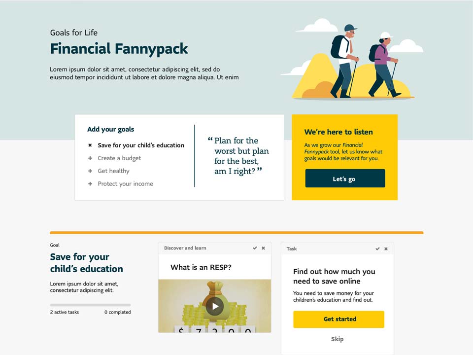
During our first release, we ran behind schedule and the Plan Builder was de-scoped. For our second release, we were able to redefine how Sun Life approached planning tools. I conducted user interviews, authored a competitive analysis, and looked at our existing capabilities. I noticed Ella, our digital financial coach, was under-utilized. I had the idea to explore a conversational UI where she led the client through a plan. When put in front of users, her presence greatly improved engagement. Ella brought a human element to the interaction and allowed us to use friendlier language. It performed much, much better than before.
We improved the flow so that users now planned step-by-step rather than exploring on their own. Users were also able to skip sections. The content was improved to include common questions and remove unnecessary articles. We completely dropped the healthcare provider section. This was intended to feel holistic, but confused users saw it as irrelevant. In addition, we completely overhauled the design. We focused on a conversational interaction led by Ella — something that had never been tried before. We also modernized many of our legacy design system components.
Conclusion
Building, testing, and releasing the Starting a Family micro-site was an amazing experience. From a marathon of development, racing to stay ahead of our developers, to learning from failure and re-designing many parts of our experience, the process was a delight. In the end, we were able to re-imagine a key journey for clients, move the organization towards more agile ways of working, and push the boundaries of Sun Life's design system. I was not only able to play a role in the modernization of our design system but also pioneer new conversational styles of interaction with Ella, our virtual assistant (which would be adopted later).